Deciding whether to relocate is a complex decision. This solution aimed at helping users to compare city facts by importing multiple government data sources and synthesizes them into digestible data visualization.
A 11-week graduate project from research to design & development using Tableau.
See final paper (40+ pages) here.
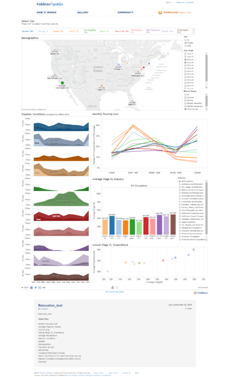
Final product screenshot.
Interactivity cannot be presented here due to data limits of
Tableau online. Please see a video demo
at the end of this article.
Design Question
How can we help people visualize reliable data to make a better relocation decision?
Process
Research Question > Research data, cleaning & analysis > Design
& Usability Test > Iterate
Brainstorming & Ideation
Datasets from multiple government sources. Interviews & surveys analysis.
Mindmaps, personas, Balsamiq prototype.
Research & Data Cleaning
We had a very aggressive scope in sourcing the data sets for
11 metropolitan areas from government sources (U.S. Census,
Bureau of Labor of Statistics, and the National Oceanic & Atmospheric
Administration). Data colllection and cleaning took weeks, which was
one tougest part of the project.
Design
Concepts & Mockups
Balsamiq mockups. Early design took advantage of Tableau prebuilt functions. Tabs were used to separate each relocation factor. Comparison between the factors was difficult.
After removing tabs, the next iteration was a flat design where all content could fit to enable comparison.
However, navigating content became a challenge and users needed help to form relationships. An onboarding tutorial concept was then experimented.
Precipitation (middle) data's color was removed to reduce visual noise because the density/value (i.e. black & white) alone is sufficient to indicate the range of precipitation values.
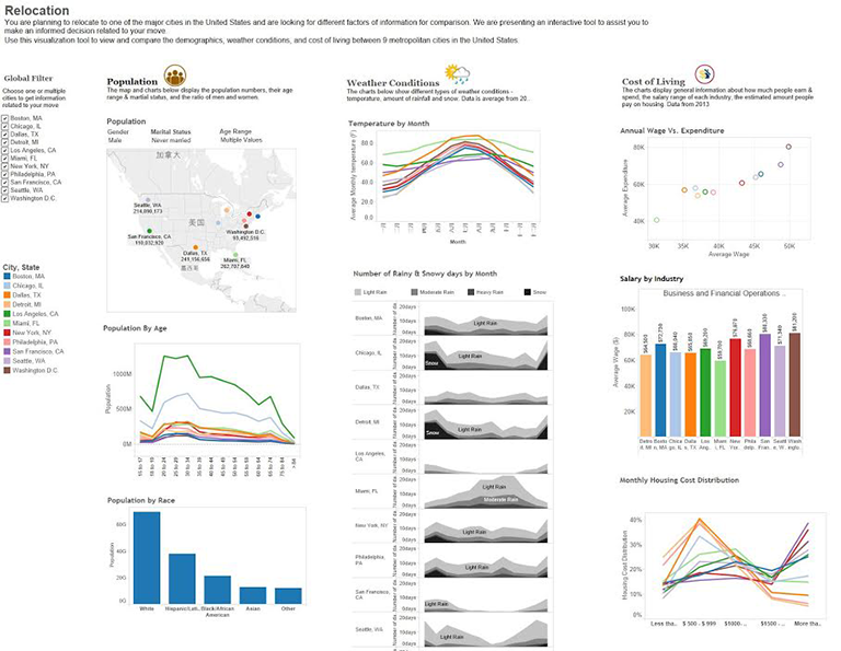
The final design was a 3-column Pinterest-style boards layout. This example shows a common user scenario where user is comparing between two cities.
Usability Test Results
Usability tests revealed common errors in data encoding/labelling, and content navigation challenges. New opportunities were identified (e.g. "Crime rate and weather should be helpful." ~participant).
An example of how population and men/women ratio graph evolved.
Literature
This project was rooted in best practice and research literature by the these scientists and scholars:
Bertin, Card, Mackinlay, Schneiderman, and Tufte.