
T-Mobile

How can we help the store sales staff use iPad with confidence?

Background

Design to Solve the Right Problem
Employee satisfaction of using iPads in T-Mobile stores remained low since the initial launch in year 2013. Development believed that a faster bug fix will solve the problem. A plan to develop an iOS application to speed up issue reporting process was created.
Users of this application are stores sales who are often busy multi-tasking.
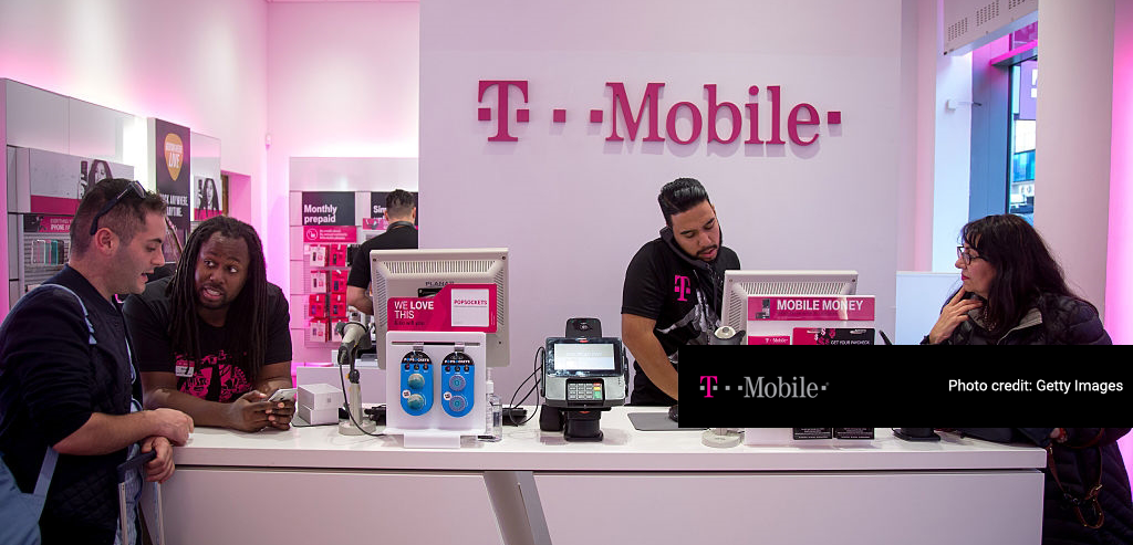
Ipad minis were introduced to increase the mobility and speed of serving customers, but technical problems had discouraged many to use them.

My Role

Interaction Designer and Program Lead

I managed the entire project from end-to-end: from working with stakeholders and partner teams to get project approval, to iterating design concepts, planning & coordinating UX resources (research and visual designs) to deliver the final product.
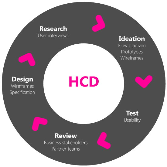
Specific deliverables in the T-Mobile HCD process.

Research

One part of research involved learning the existing people, systems, and process. Another part of research I partnered with a researcher to find out the current user pain points. We interviewed from 2-7 employees working at support and sales to understand both sides of the stories.
"Submission process is cumbersome!"
"Things go to a dark hole and no one ever returns to us."

User's Current Experience

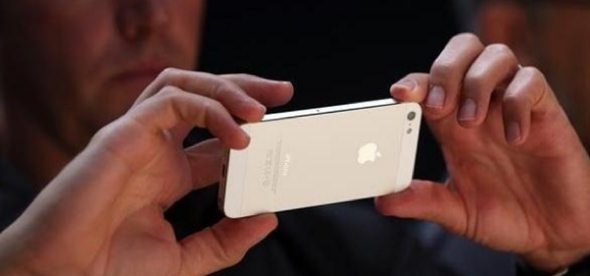
Before design, user took picture of the problem using his/her own cell phone, then sent it to his manager who will in turn fill out a Sharepoint form in the back office.
What's the likelihood of them doing so?

Design Goals

Fast, Right, and Clear
While it wasn’t surprising to learn that processes were complex and flawed, it was surprising to learn that stores employees’ were particularly upset about voice being heard and that their action never make any impact to the company. To keep design on track, these were my goals and focus questions:

Efficiency. Efficacy. Transparency

Transparency, in particular was a goal to make sure users are properly informed and that nothing goes to a 'dark hole'.

Focus Questions

How can we help solve these technical & process problems? How can we increase problem visibility across the organization?

Concepts

Convenience & Speed
To encourage users making the extra effort, speed and simplicity were priorities. Initial concepts targeting efficiency evolved around being able to submit an issue with minimum effort.
Ability to report problem immediately when it occurs.
User fills out form and submit.

Concepts

Voice Transcription
An idea to use text-to-speech functions to replace typing.
User tabs the field and speak, instead of filling out a form.
User did not find this feature to be practical due to the noise volume in stores.

Concepts

Relevance
By populating relevant results, the goal was to minimize typing error and speed up the process.
Populating known issues as user types the keywords to minimize typing. Also also user to attach relevant screenshot.

Concepts

Transparency
Increased visibility meant providing clear statuses and notifications, where everyone can see what & where the existing issues are, and if a resolution has been reached.

The Uh-ohs

Surprises from Usability Tests
Several rounds of tests uncovered interesting user behaviors. Though users loved the convenience, the tracking ability and the trends, there were hesitations and holdbacks. They continued to be concerned about performance and how inefficiencies might impact their work.
"Oh no, it's gonna be slow."

Usability Tests Results Highlights

Fear

Even though there wasn’t any performance lag in the prototype, a couple of users responded negatively in the prepopulated suggestion feature. They feared that such interactions will slow down the performance.

2 languages 1 UI

The sales and support teams used different lingos. While one set of selection values made sense to one team might mean Greek to another. The UI did not resolve this conflict.

No camera policy

Users never took screenshots in the past because of a privacy policy disabling the camera function, not because they did not know how, as it was assumed.

Measure against goals

At this stage, I returned to the focus questions and asked myself, had I solved the problems as planned?

Had I help improved the visibility across organization through the design?

Yes.

Had I helped solve technical and process problems?

No, not quite.

What had I done?

I improved the way an issue was reported.

What was still happening?

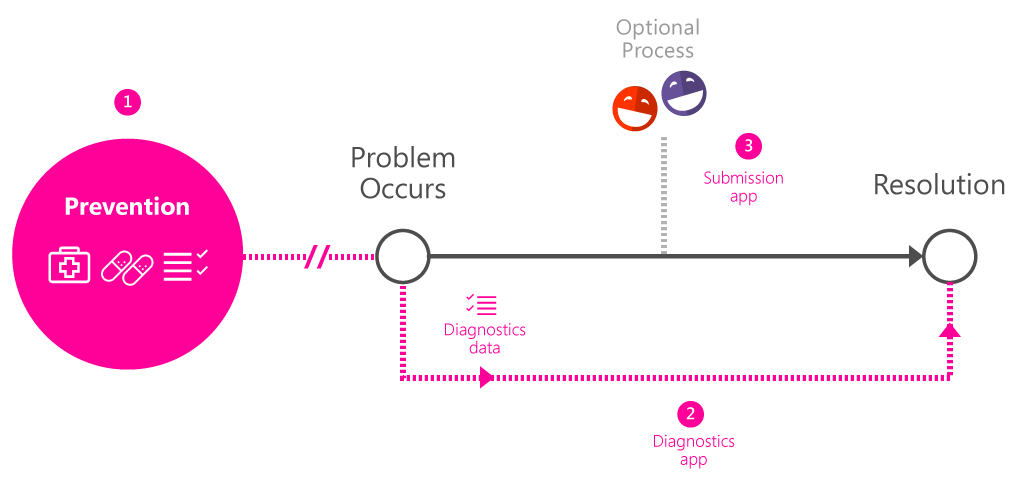
There were unsresolved communication gaps between the submitter and the recipient. This problem had not been solved.

What should happen?

Problem prevention by diagnosing issues before it appears, and made human intervention optional. A separate diagnostic application project was created as a result (beyond the scope of this walkthrough).

Outcome

Two iOS apps launched a pilot program by the end of 2015 and went live in ~3000 stores in the U.S. in 2016.
Link to Prototype Demo

Responses from users

"This simplifies it! Especially without having to email anything."
This is long overdue, we really need a way to talk to help desk directly, and this - will definitely help.
When can we get this app?